GAM
GAM is a consortium of physicians creating novel metrics of healthcare quality.
Deliverables
WEB DESIGN
BRAND IDENTITY
BRAND STRATEGY
FRAMER DEVELOPMENT
Problem
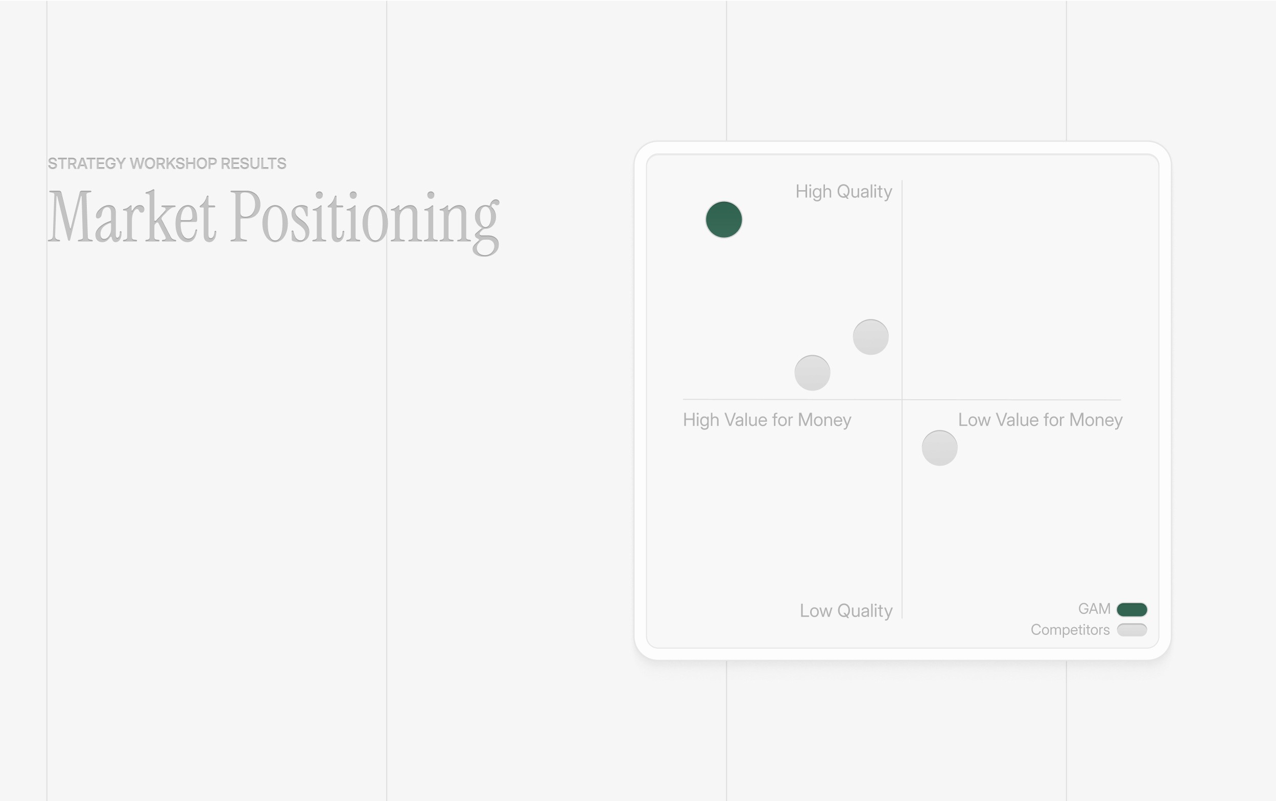
GAM needed a rebrand to strengthen its credibility and clearly communicate its impact in healthcare appropriateness measurement. Their branding, website, and dashboard lacked the polish and clarity needed to convey their mission of reducing waste, improving quality, and rebuilding trust in healthcare.
Solution
CONNECT


TESTIMONIAL